Magazine Spreads
gd4 | spring 2022
gd4 | spring 2022
Project: To research, curate and design a hypothetical magazine, including the cover and two spreads. Spread one to be a featured article and spread two, a "listicle."
Solution: Within the project specifications, I have created Merj: Art & Culture magazine. This publication is for anyone feeling displaced by mainstream music and art, and views electronic music as an artform. They value inclusion and respect and also hold high standards for art and design. The overall look and feel is a little grungy but artsy and features lots of articles about music making and it's process. I took inspiration from New York Magazine, Record Culture Magazine and Eye On Design.
After researching my theme and audience, I compiled a creative brief to clarify my intentions.
The two above pages showcase some of the visual inspiration I used for content and style.
I sketched out some ideas for spreads and cover designs using hierarchy and different design layouts. I also began playing with typefaces for the title.
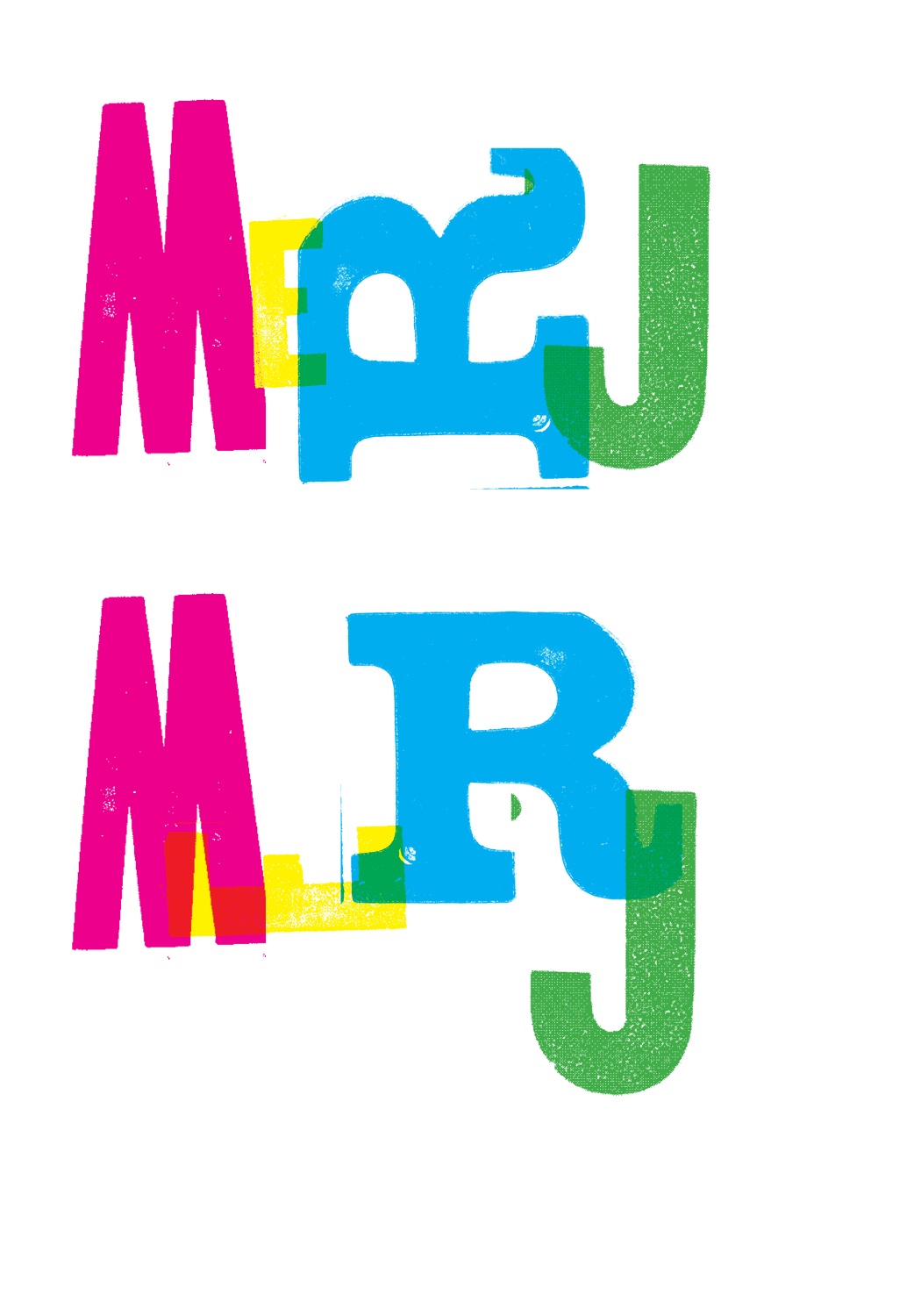
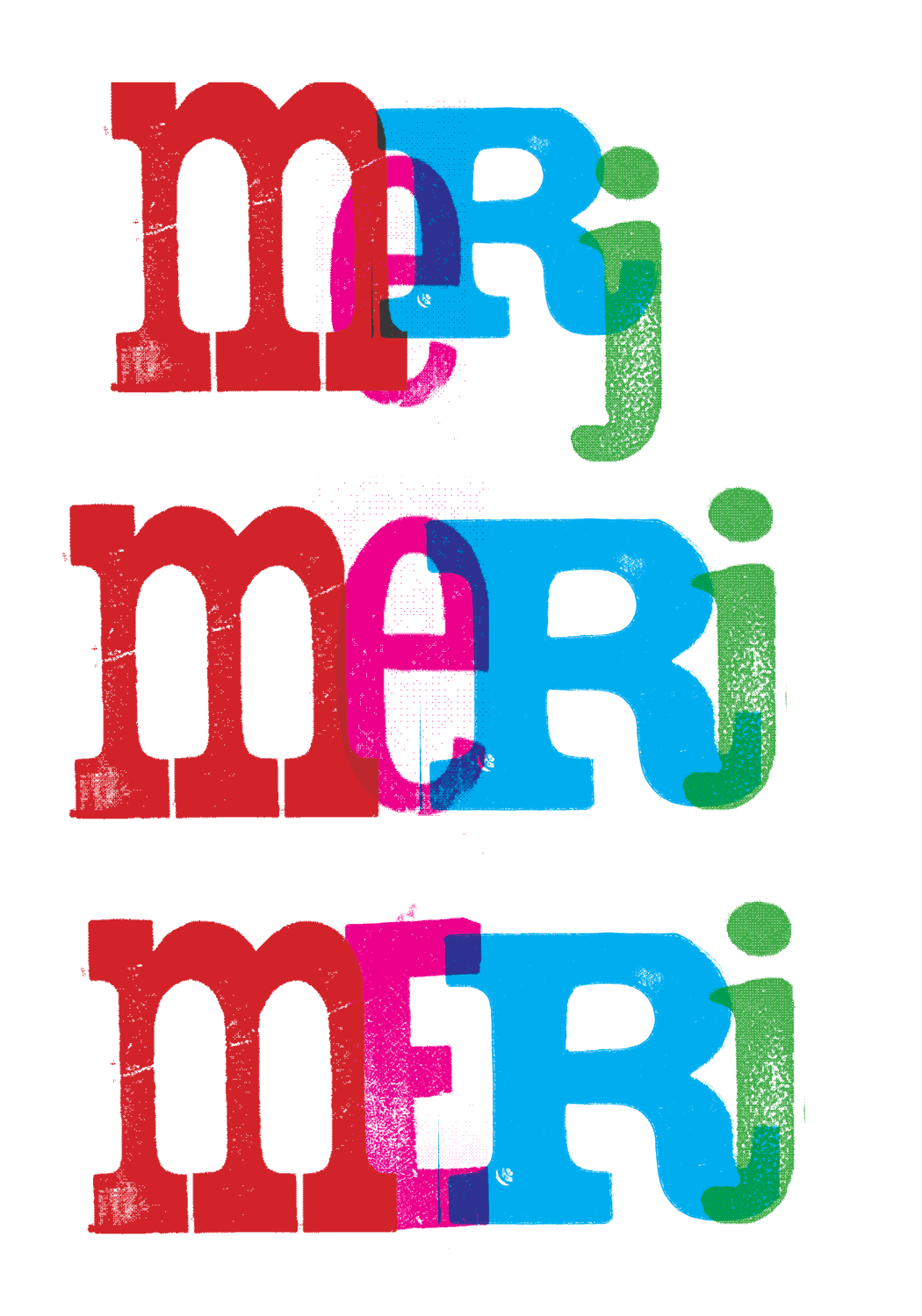


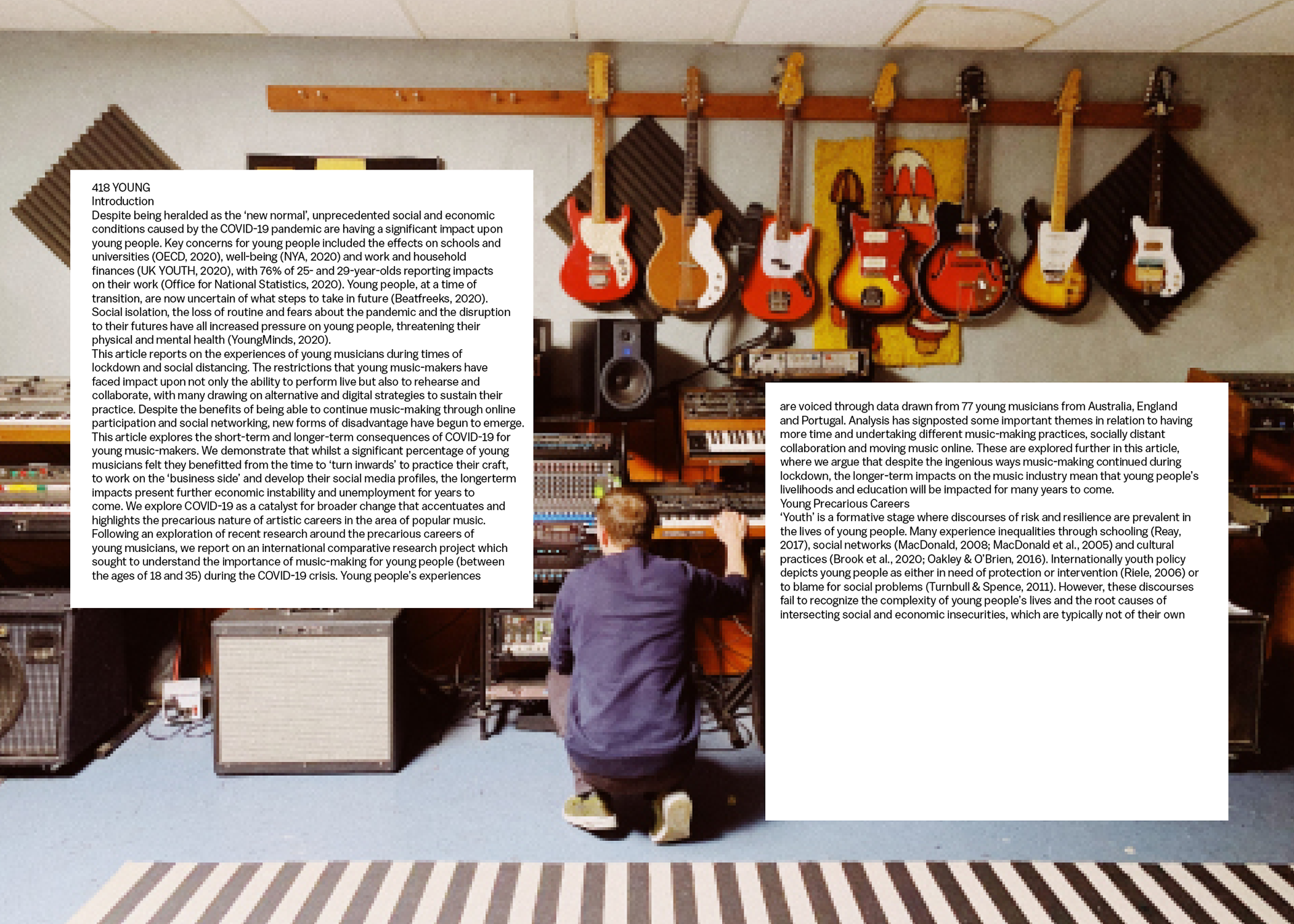
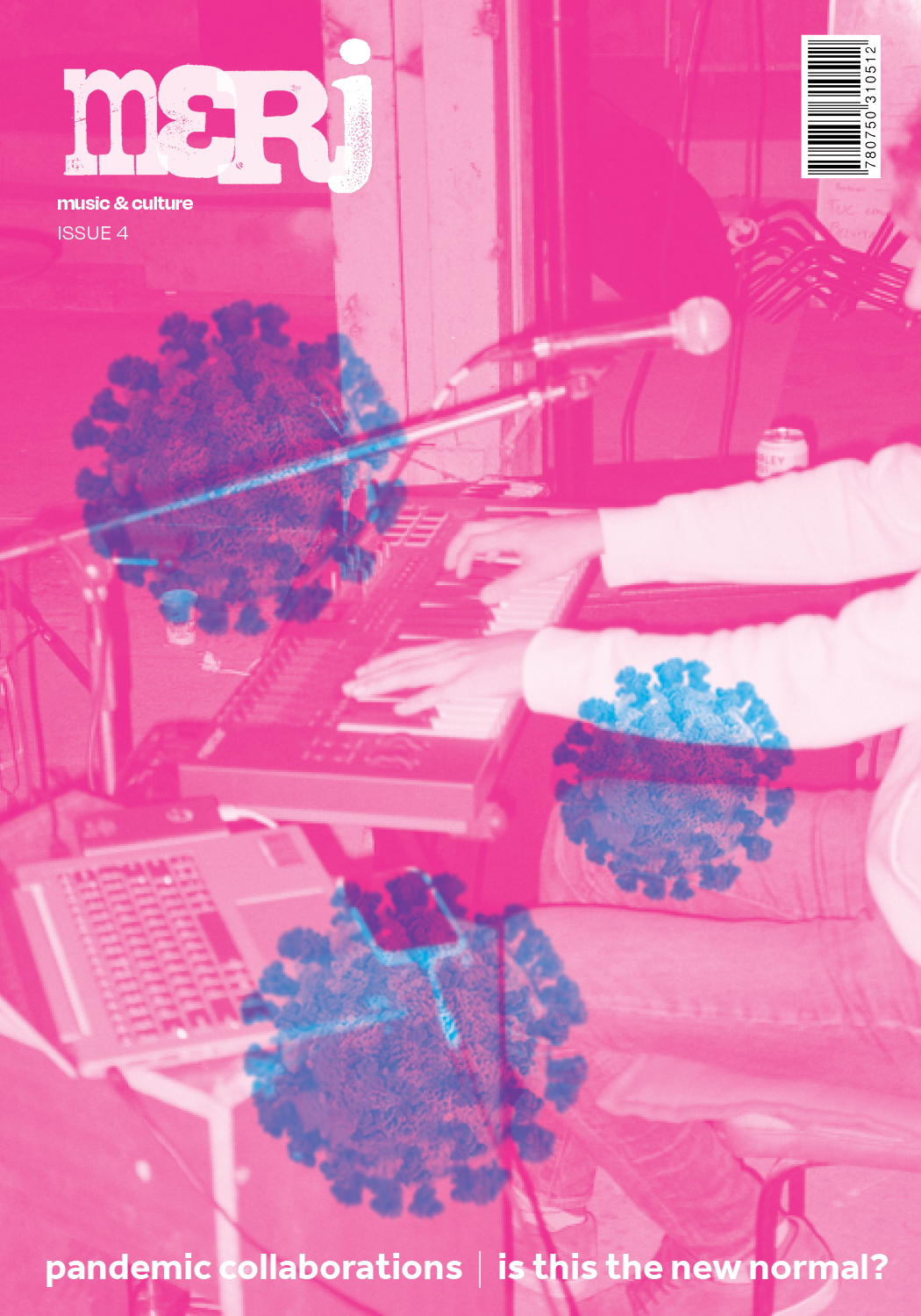
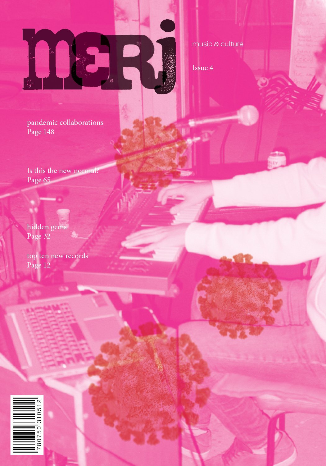
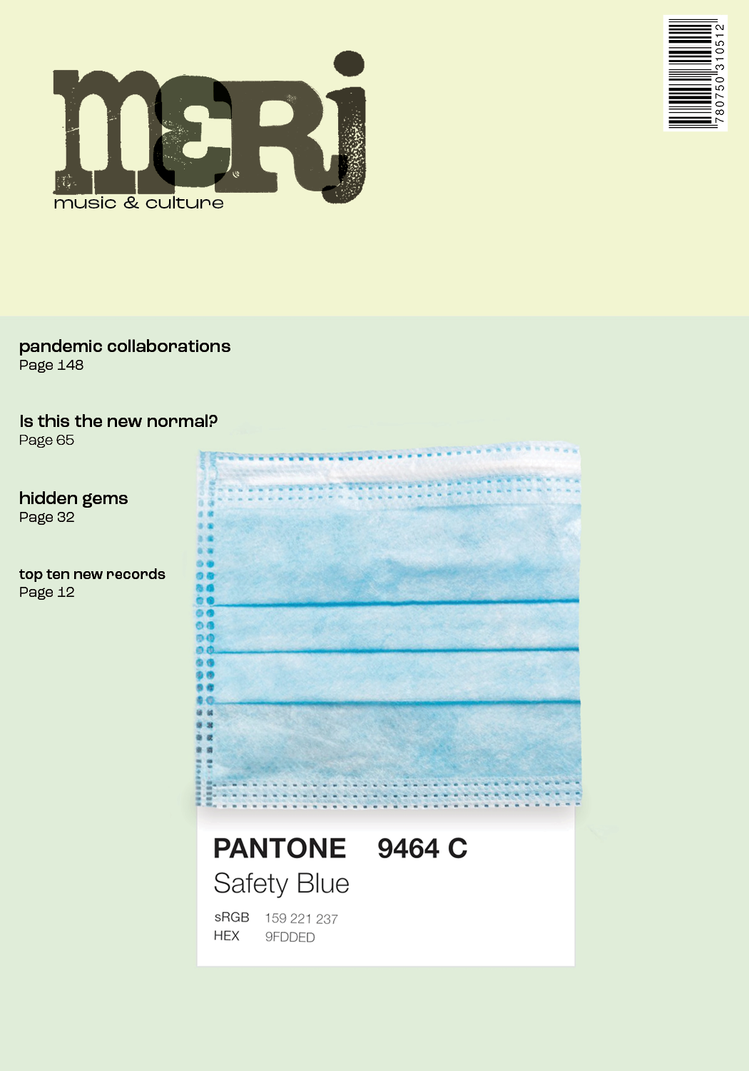
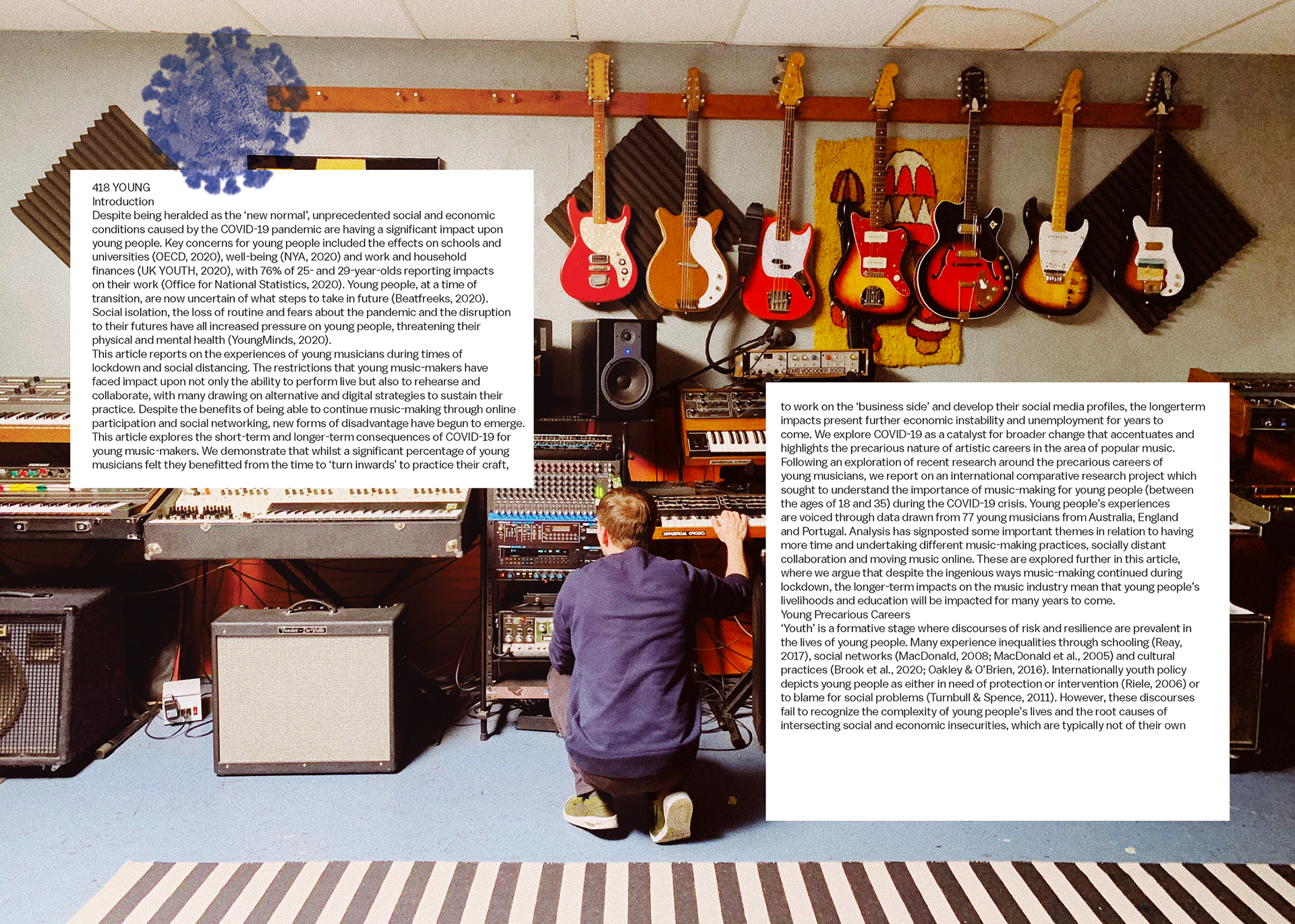
After I gathered all of the elements I needed, I brought them into InDesign and tried some layouts. I saved images of letterpress type as a tiff, so I could arrange and recolor them in Illustrator and InDesign.
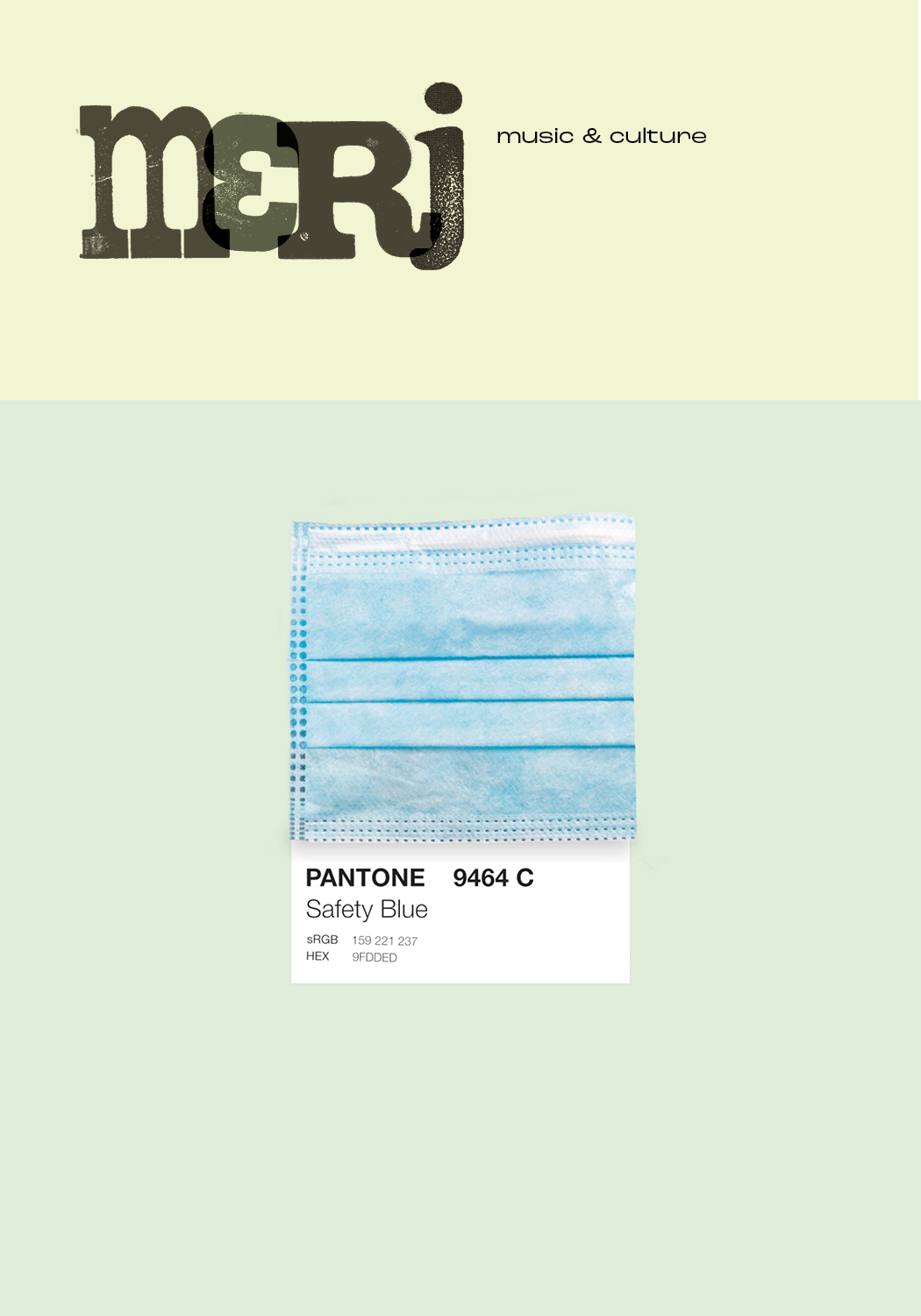
The final brand elements for Merj.
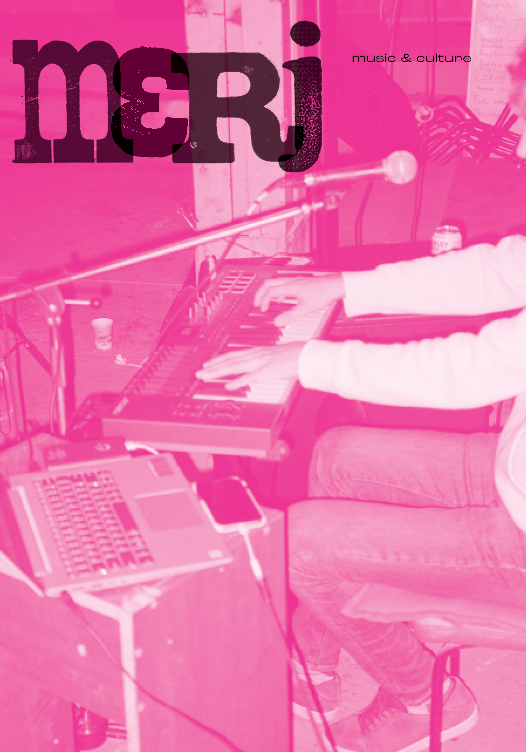
Final cover page.
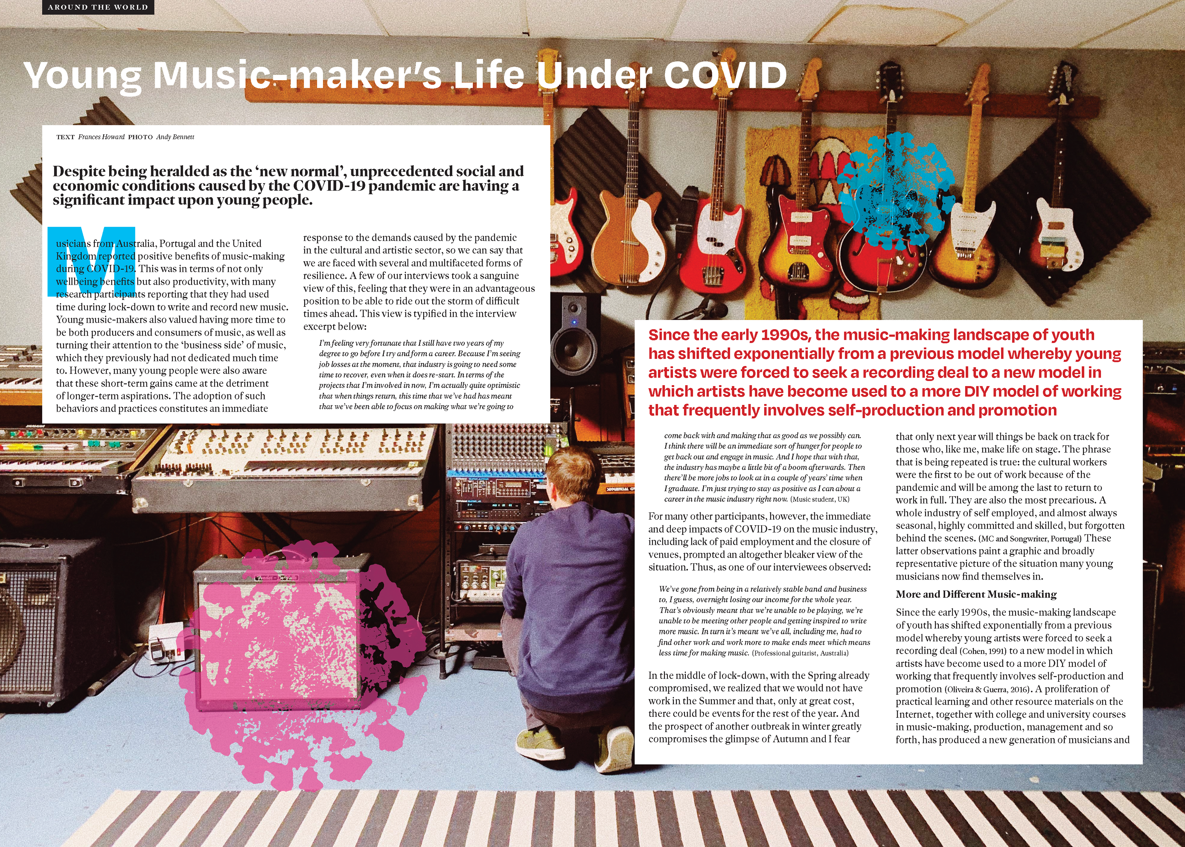
Final article spread.
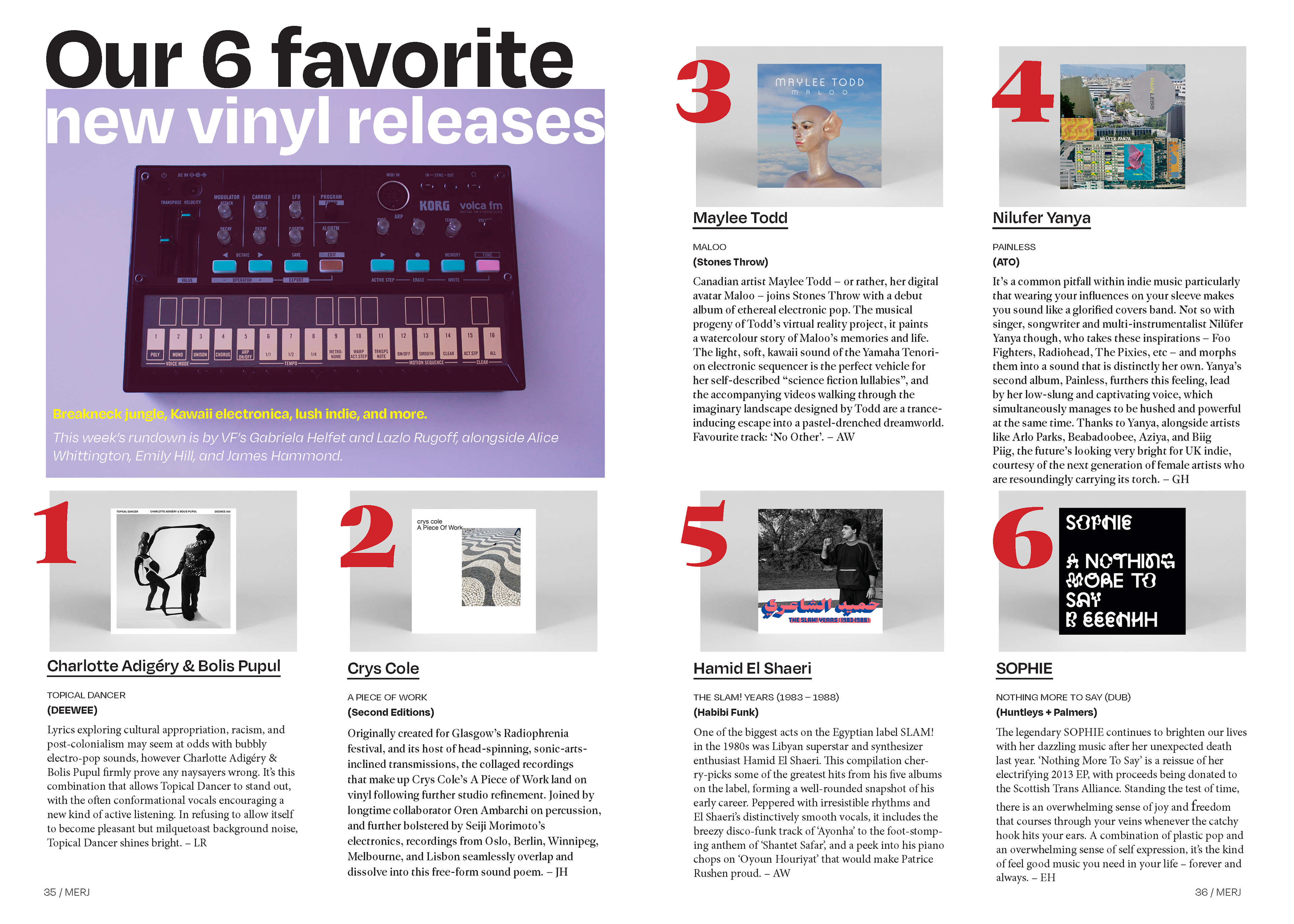
Final list article spread.
